Contrary to what you might think, creating a logo can be a complex task. It all depends on the artistic meaning you want to give it, but also on the meaning and vision you want it to convey.
In our case, it was after a month that we were able to complete our logo, after many modifications and not without testing various logos. Our aim wasn't just to have a logo, but even more to have one that truly conveyed our vision. So, what's behind this logo and the little details that go with it?
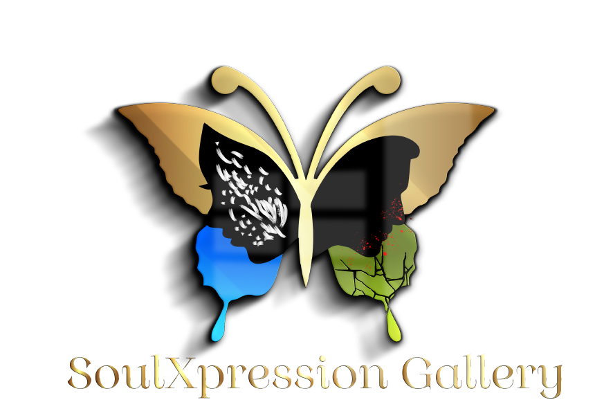
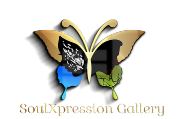
The logo is divided into four parts, all of which work in harmony with each other. We have the gold area above, the blue area below on the left side, the green area below on the right side, the black area in the center and all these areas together form a butterfly, with the right wing slightly broken downwards and a man and a woman in the center. But what do the butterfly and all the colors mean? Why the cracked wing? And what about the man and woman and the details on them?
The butterfly and the crack in its wing
The butterfly is a fragile creature that loves the warm seasons. It spreads its wings and flutters from one place to another, flying away happily and freely, enjoying the sweetness of the good weather and all that it brings with it. The butterfly on our logo represents the freedom and joy that every human being desires. Every human being aspires to freedom: the freedom to be, the freedom to think, the freedom to develop as an individual, the freedom of expression, the freedom to build oneself, the freedom to fly away, and so on. Being free is a fundamental right.
Without its wings, the butterfly cannot take flight and loses its freedom. You can see the crack on the lower part of the wing of the butterfly on the right side. This crack represents a break. For one reason or another, the butterfly's wings have been damaged and it can no longer fly and flutter as it once did. It is now deprived of its freedom. And so, it is with Man. Unfortunately, there are times when we are deprived of our freedom for one reason or another. Perhaps at some point we have suffered a hard blow from which we are finding it difficult to recover, or perhaps we have never even been able to taste true freedom and enjoy it, and so on. Whatever the reason, you find yourself trapped and feeling frozen in time.
The colours
The golden color expresses many things, including a spiritually, physically and psychologically healthy soul. However, this does not mean that such a person is spared the pains of life.
Blue, on the other hand, is the color of heaven. The sky represents what is elevated, and in our case, it refers to the divine. Heaven as the place where God and his angels sit; God himself being the source of all blessings, of all graces, of all that is excellent and perfect. Such a blue sky is usually seen on sunny days. The blue in the logo thus underlines the importance of the divine, its impact on Man, but also the happy and blessed days or seasons when Man consciously or unconsciously enjoys divine grace.
The green color represents two things: Nature and life. Green is the dominant color in nature and a green plant is a living plant that has not yet completed its cycle. In spring, the weather softens, and you can see plants and trees budding everywhere and flowering. Cheerfulness begins to appear on people's faces. Spring marks rebirth. In summer, the trees are wrapped in their green foliage, which itself dances to the rhythm of the wind under the sun's rays. People are happy again; coffee shops are packed and so on... Through the color green, we express the importance of nature and the life that emanates from it, the need to preserve it, but also its importance for the physical and psychological well-being of mankind. And generally speaking, life itself is precious, whatever the forms of life on earth, life is precious, and it is important to preserve and nurture it. So, life isn't just about breathing, it's a harmony of many things at different scales, and it's this harmony that constitutes life. Breathing is only proof of someone's existence, but not proof that he lives.
The color black represents the dark seasons in a person's life. Those times when people experience sad situations, when they brood, when nothing works out the way they want, etc.
Man needs God to lead a happy life (the colour blue), even if this does not spare him from unhappy days (the colour black), because this is the cycle of life; through his closeness to God, Man allows himself to be positively transformed in his inner and outer being; this transformation will itself gradually lead him to become more aware of what life is all about (the color green) to ultimately achieve a healthy soul (the color gold).
Man and woman
Man and woman are placed at the center of the logo to express the fact that human beings, including children, are at the center of the gallery's attention, as already emphasized in the explanations above. Hence the gallery's name SoulXpression, which reads Soul Expression. Why the grey spots on the woman? And what do the black spots represent on men?
Gray spots represent negative human emotions such as envy, jealousy, contempt, covetousness etc... The red spots, on the other hand, represent blood, on the one hand to characterize the violence that often inhabits Man and drives him to commit atrocious crimes, and on the other hand, it also represents the blood of the human being that flows because he has been the victim of physical violence or has been subjected at some time to a very harsh ordeal in his life; so harsh and violent that it is breaking him, draining him of his energy and leaving him both physically and psychologically destitute.
This is the hidden meaning of our logo. We hope you've enjoyed this journey and will now look at our logo with fresh appreciation. Your comments are most welcome.
